Due to the expense and timing, the client felt there was too deep an investment in the existing logo and wasn't comfortable changing it. We acquiesced and moved forward with minor tweaks to the existing mark.
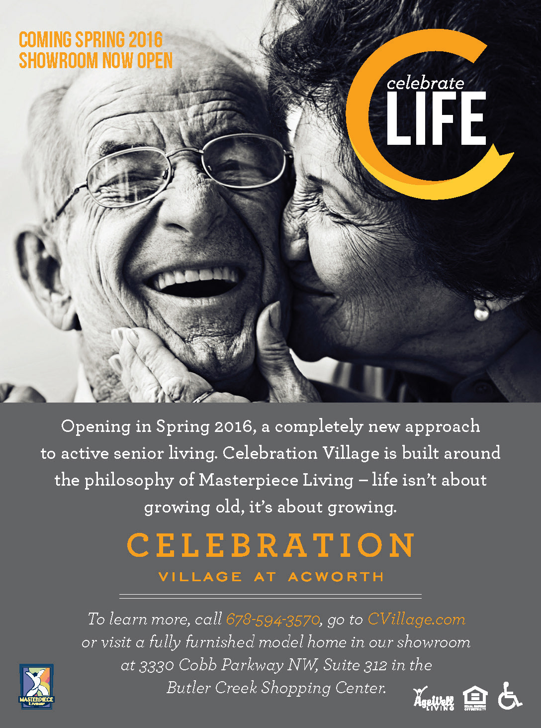
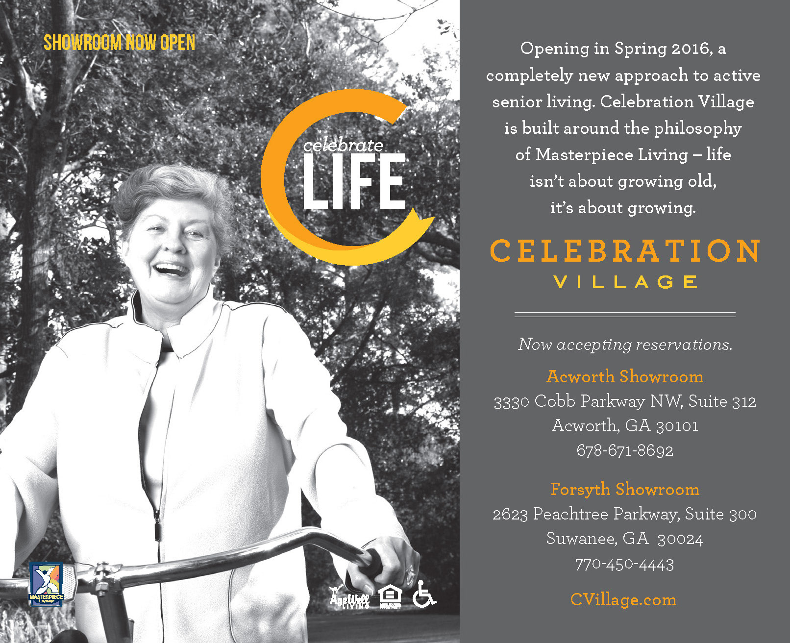
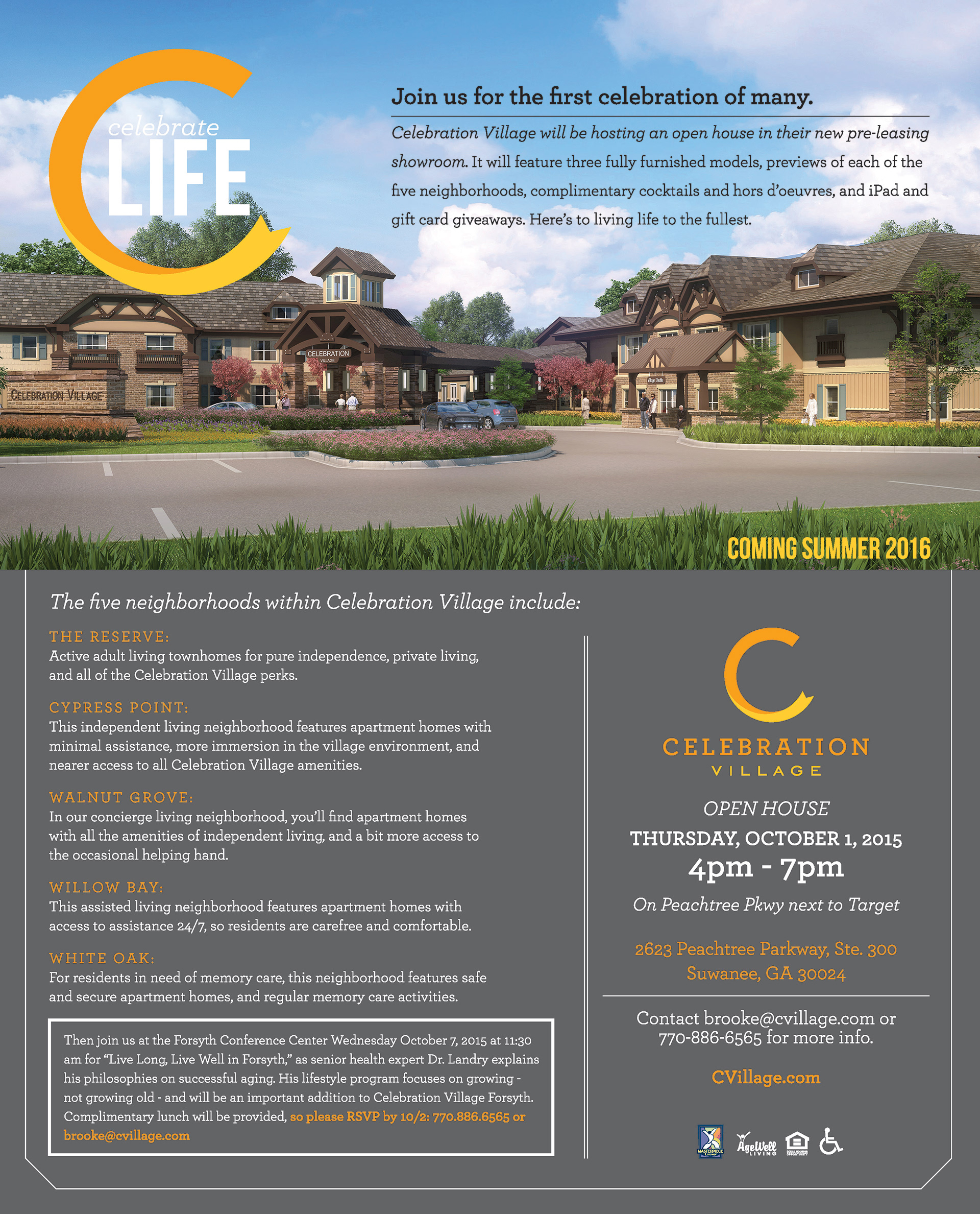
These ads were part of the existing branding. As you can see, they were trying to utilize black and white lifestyle images and a neutral color palette to create separation for the orange and yellow colors in their logo. The effect is a bland and inconsistent branding strategy.
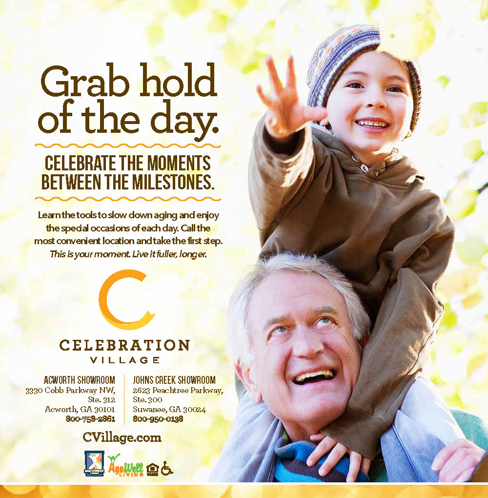
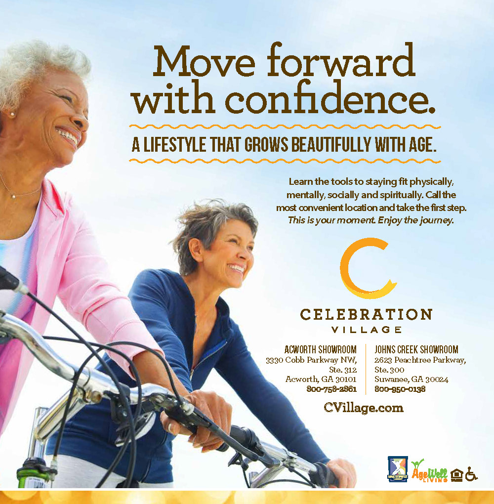
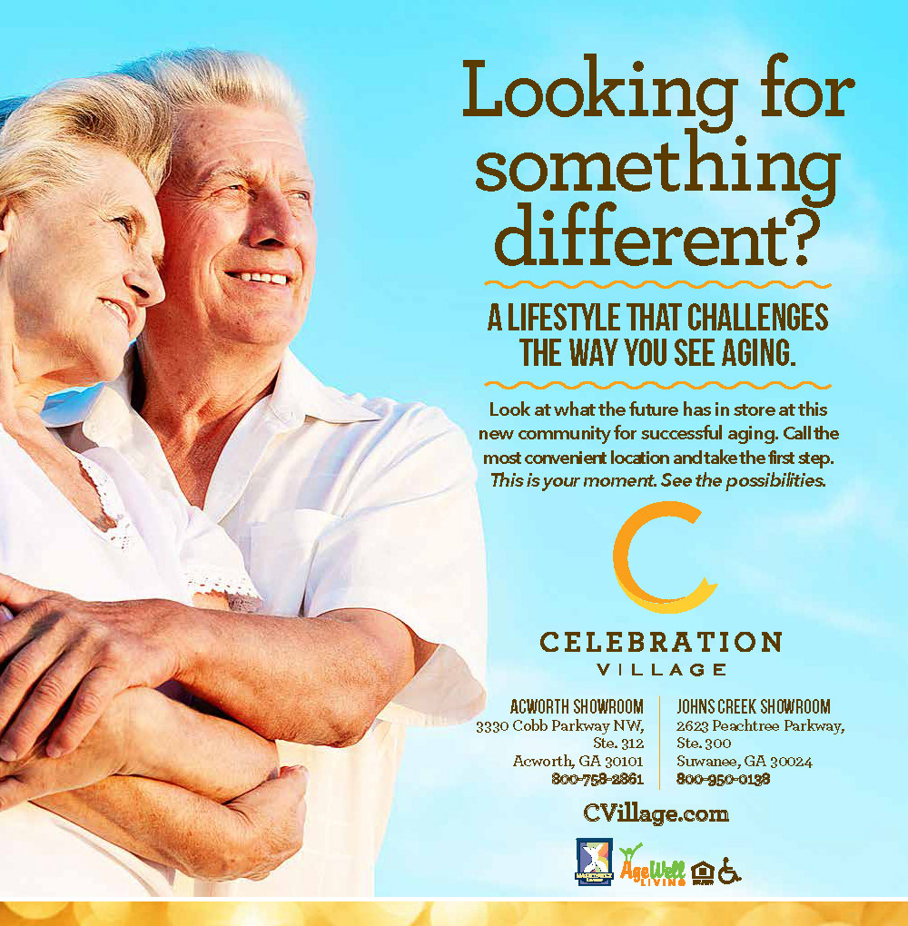
Our approach was to use short copy with dynamic lifestyle images that would bring the product to life. We used a celebratory border background to further enhance the brand colors, but also create visual motion.
Billboard support was import for brand awareness, as each community was in a well trafficked area and signage was limited, so this tactic helped support the messaging and clarified the product offering.
Lifestyle and Services collateral brochures support the brand and provide an overview of the lifestyle available at the communities. This collateral material features information on all levels of care.
Direct mail invitations to events are the backbone of senior living advertising. These events are designed to give potential residents a "taste" of the community and allow the marketing staff to educate consumers.
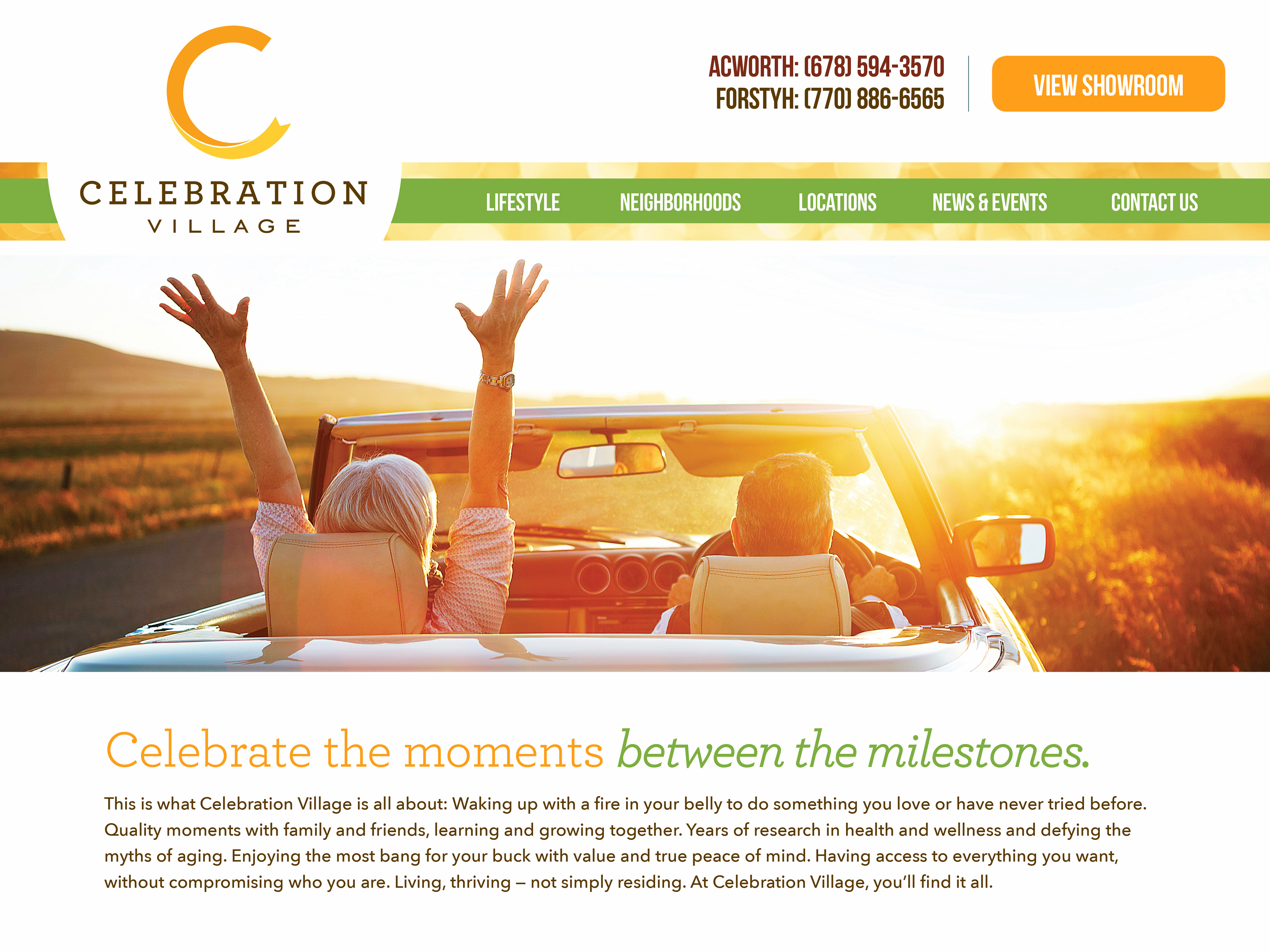
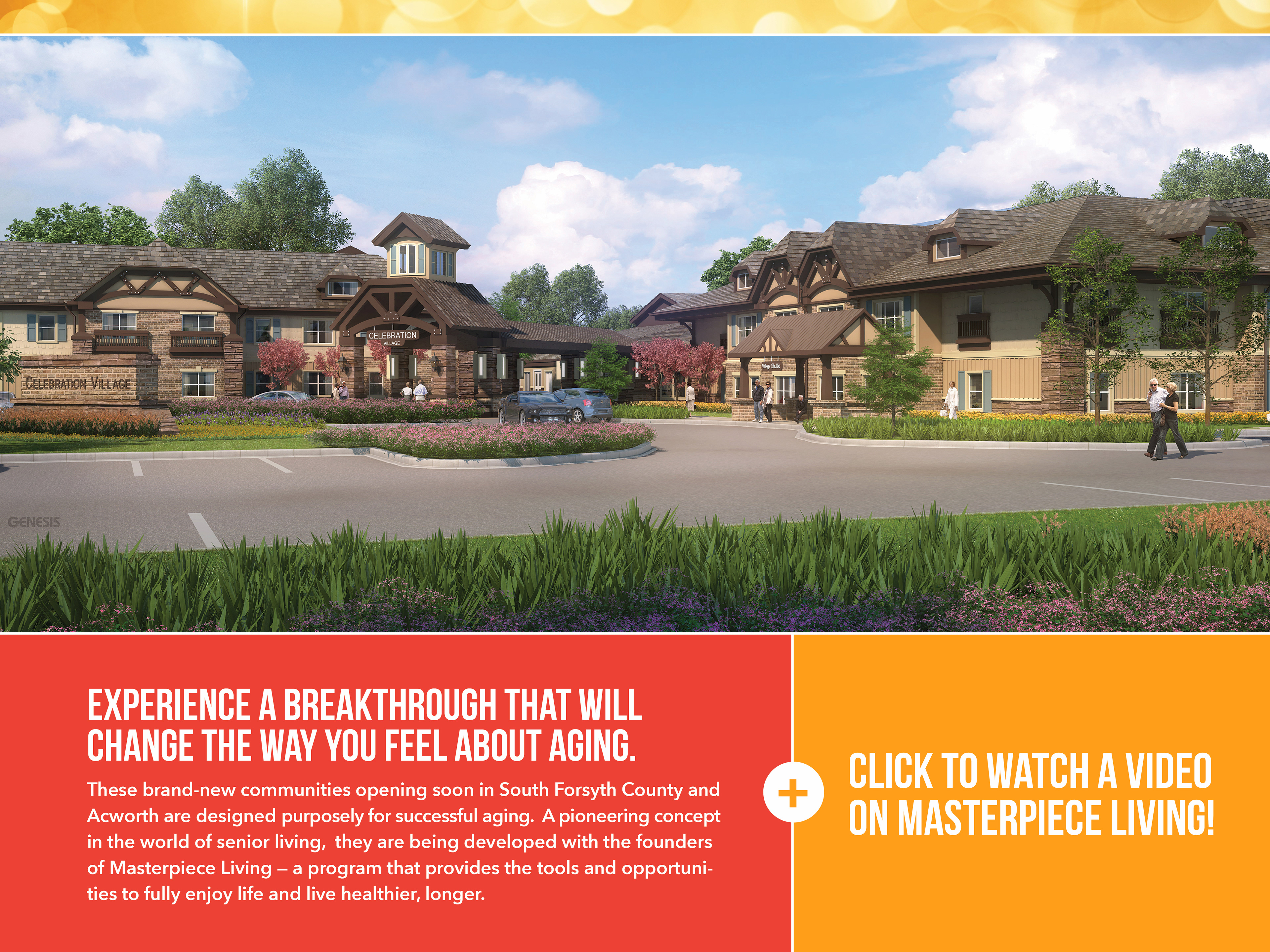
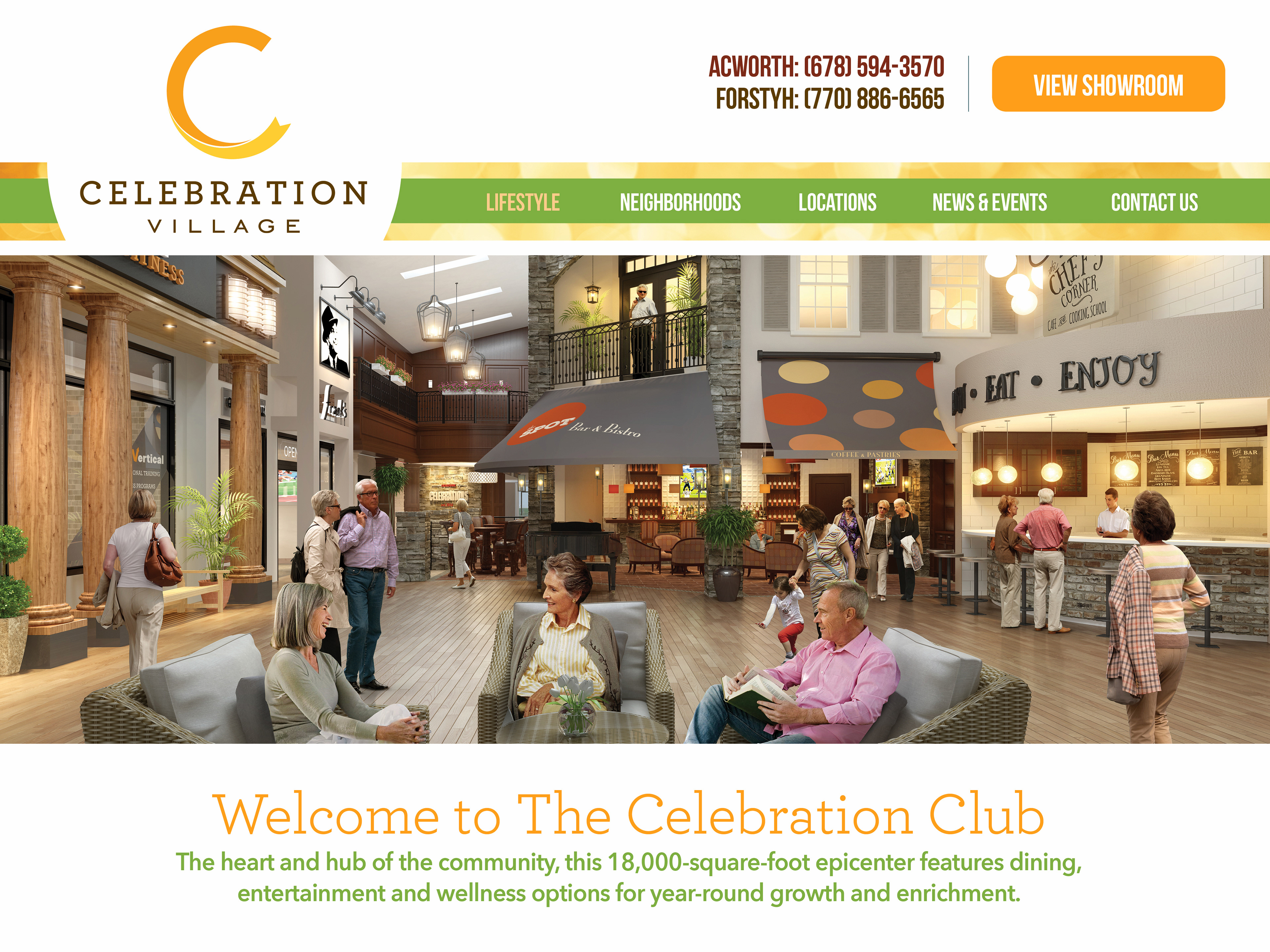
Website design was intended to be very visually driven with manageable copy that supported the active lifestyle and created excitement about the modern services and amenities. The total turnaround time to complete the entire rebranding process was less than 6 months. The communities are now open and thriving. Visit the website to see the updated architecture, lifestyle and overall branding transformation.
